The OnTarget Dashboard is a powerful, user-friendly tool designed to help educators analyze assessment data—particularly from local assessments—to monitor student progress and guide instruction. The visualizations help educators and administrators understand how well their assessments are functioning as measurement tools and how different student populations are performing. The data combines psychometric analysis (measuring how good the test questions are) with demographic performance breakdowns to give a complete picture of assessment effectiveness.
Here’s a breakdown of what it offers
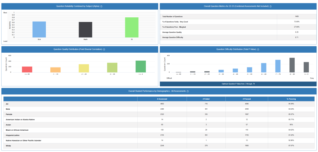
Question Reliability by Subject (Top Left)
What it shows: This bar chart displays reliability coefficients (Alpha values) for three subjects: ELA (English Language Arts), Math, and SS (Social Studies).
What reliability means: Reliability measures how consistently an assessment produces similar results. Think of it like a bathroom scale – a reliable scale gives you the same weight reading each time you step on it. For assessments, we want questions that consistently measure student knowledge.
How to interpret the scores:
- ELA: ~0.67 – Moderately reliable
- Math: ~0.66 – Moderately reliable
- SS: ~0.77 – Good reliability
What this means for teachers: Social Studies assessments are performing most consistently, while ELA and Math assessments could benefit from review. Scores above 0.70 are generally considered good, above 0.80 are excellent.
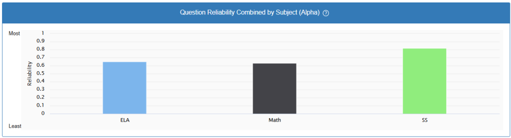
Overall Question Metrics Summary (Top Right)
Key Statistics:
- Total Questions: 1,489 questions analyzed
- Quality Rating: 73.06% of questions rated as “Fairly Good” to “Very Good”
- Problem Questions: 27.00% rated as “Poor” to “Marginal”
- Average Quality Score: 0.29 (on a scale where higher is better)
- Average Difficulty: 0.71 (where 1.0 = very easy, 0.0 = very difficult)
What this means: Most questions are performing adequately, but about a quarter need improvement. The average difficulty suggests questions are moderately challenging but accessible to most students.
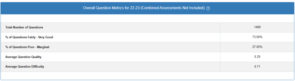
Question Quality Distribution (Middle Left)
What it measures: Point biserial correlation – how well each question distinguishes between high and low-performing students.
The distribution shows:
- Red bars (negative values): Questions that poorly discriminate or may be flawed
- Yellow/Orange bars (0.1-0.29): Acceptable but could be improved
- Green bars (0.3+): Good quality questions that effectively measure student knowledge
Teacher takeaway: The concentration of questions in the green range (0.3-0.4) is positive, but the presence of questions in lower ranges suggests room for improvement in question writing or review.
Question Difficulty Distribution (Middle Right)
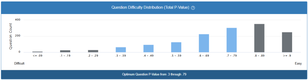
What P-Value means: The percentage of students who answered correctly. A P-value of 0.8 means 80% of students got it right (easier question), while 0.2 means 20% got it right (harder question).
Optimal range noted: The dashboard indicates 0.3-0.79 as the optimal difficulty range, shown in the darker bar at the bottom.
Current distribution: Most questions fall within or near the optimal range, with a good spread from easy to difficult. This creates a balanced assessment that can measure different skill levels.
Student Performance by Demographics (Bottom Table)
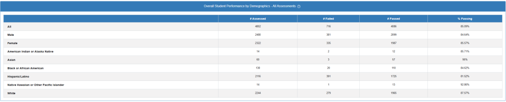
Performance breakdown by demographic groups:
Highest performing groups:
- Asian students: 95% passing rate
- Native Hawaiian/Pacific Islander: 92.86% passing rate
- American Indian/Alaska Native: 85.71% passing rate
Areas of concern:
- Significant achievement gaps exist between demographic groups
- Male students (84.84%) outperforming female students (82.57%)
- Some groups showing lower passing rates, indicating need for targeted support
What this means for instruction: These gaps suggest the need for culturally responsive teaching practices and differentiated instruction to ensure all students have equitable access to learning.