- Associated Instructional Materials:
🧠 What is “Question Quality Distribution”?
Think of this report like a report card for test questions. Just like students get grades, each question on the test gets a “quality score” that describes how well it’s working.
The big question this report answers: Are my test questions actually measuring what my students know?
Do students truly understand the material or are they’re just getting lucky with guesses. Good test questions help you tell the difference between students who really know the content and those who need more help.
How Does It Work?
Each question on your test gets a score that measures how well it separates strong students from struggling students. Good questions should be answered correctly more often by students who did well overall on the test, and answered incorrectly more often by students who struggled with the test as a whole. Here’s the simple idea:
- Good questions: Students who did well on the whole test also got this question right, while students who struggled on the test got this question wrong
- Poor questions: There’s no clear pattern – sometimes good students miss it, sometimes struggling students get it right
Understanding Your Results
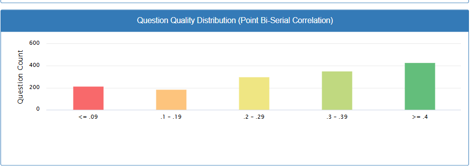
The report shows you a bar chart with five colored categories. Think of it like a traffic light system:
🔴 Red Zone (≤ 0.09 Very Poor Questions)
What it means: These questions aren’t working at all. Both strong and weak students are getting them wrong at about the same rate. Students are basically guessing. Example: A question that’s so confusing that even your best students get it wrong.
What to do:
- Review these questions carefully – they may be confusing or have unclear wording
- Consider removing them from your grade calculations
- Rewrite or replace these questions before using the test again
Common issues: Trick questions, multiple correct answers, or content that wasn’t taught clearly
🟠 Orange Zone (0.1-0.19 Poor Questions)
What it means: These questions are doing a poor job of identifying who understands the material. Example: A question with unclear wording or multiple correct answers.
What to do:
- Look at how you worded these questions
- Check if the content matches what you actually taught
- Consider revising before the next test
🟡 Yellow Zone (0.2-0.29 Okay Questions)
What it means: These questions work, but they could be better. Example: A question that’s mostly clear but might have one confusing answer choice.
What to do:
- These are acceptable to keep using
- Try to improve them when you have time
- Look for ways to make the wording clearer
🟢 Light Green Zone (0.3-0.39 Good Questions)
What it means: These questions are doing a good job of measuring student understanding.
What to do:
- Keep using these questions
- These can serve as models for writing new questions
- Minor tweaks might make them even better
Dark Green Zone (≥ 0.4 Excellent Questions)
What it means: These are your best questions – they clearly separate students who know the material from those who don’t.
What to do:
- These questions are reliable indicators of student learning
- Definitely keep these questions
- Use them as examples when creating new tests
📊 What is it based on?
It mainly uses a stat called the Point Biserial Correlation — a measure of how well each question correlates with overall test performance.
What Point Biserial Correlation Measures: Point biserial correlation tells us how well individual test questions distinguish between students who know the material and those who don’t. It ranges from -1.0 to +1.0, with higher positive values indicating better question quality.
- A high point biserial (close to +1) = the question is doing a great job differentiating between students who know the content and those who don’t.
- A low or negative point biserial = the question might be flawed, misleading, or misaligned.
What This Means for Your Teaching
For grading: Questions in the red zone might be unfairly hurting student grades, while questions in the green zones give you confidence that grades reflect actual learning.
For instruction: If many questions are in the red or orange zones, it might indicate that students didn’t understand the material as well as you thought, or that your test questions don’t match your teaching.
For future planning: Good questions (green zones) show you what types of questions work well for assessing your students’ learning.
The Goal: You want most of your questions in the green zones. This means your tests are fair and accurately measure student learning.
Red Flag: If you have many questions in the red and orange zones, your test results might not be telling you the full story about what students actually know.
Action Steps:
- Review red and orange questions first – these are hurting your test quality. consider not counting them toward grades
- Study your green questions – what makes them work so well? Build a collection of your best questions (green zones) to reuse and adapt.
- Gradually improve yellow questions when you have time. Plan to revise orange and yellow zone questions before your next similar test
Remember
You don’t need to be a statistics expert to use this information. The colors and categories make it easy to see which questions are accurately reflect students’ learning and which ones need work.
This report helps build better tests, which leads to more accurate assessment if your students’ learning, better information about students, and better instructional decisions. It’s all connected!