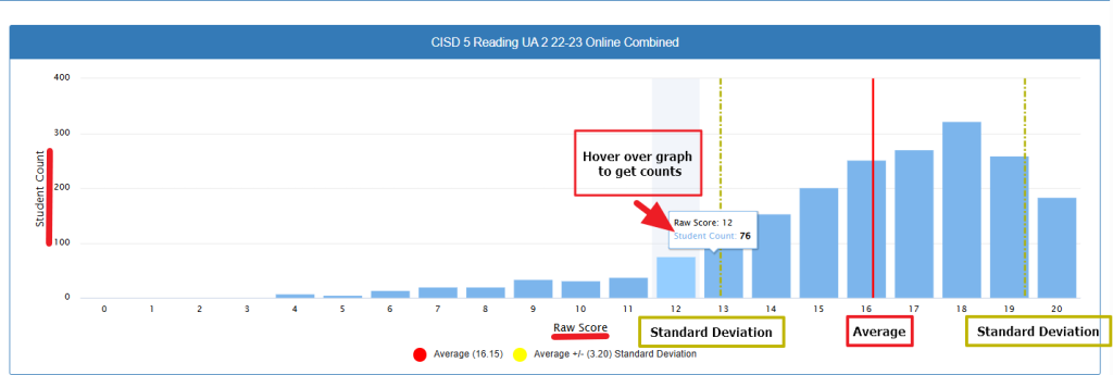
Graph of total counts of students and Raw Scores
Raw score distributions are fundamental tools in educational measurement that show how students performed across the full range of possible scores on an assessment. Here’s what these distributions typically reveal:
What Raw Score Distributions Show
Raw score distributions display the frequency of each possible score, creating a visual pattern that reveals important information about student performance and test characteristics. They show not just averages, but the complete picture of how scores are spread across the entire range.
Key Information These Charts Provide
- Typical Performance: Where most students scored
- Score Spread: How far apart the highest and lowest scores are
- Score Range: The lowest and highest scores achieved
- Unusual Scores: Students performing much better or worse than classmates
- Different Performance Levels: Groups that might need different types of instruction
Key Terms for Understanding Assessment Data
Raw Score
The actual number of points a student earned on a test, without any adjustments or conversions. For example, if a test has 20 questions and a student gets 15 correct, their raw score is 15. It’s the “pure” score before turning it into a percentage or letter grade.
Average or Mean
The typical score when you add up all student scores and divide by the number of students. Also called the “mean.” If three students scored 10, 12, and 14 points, the average would be 12 points (10+12+14=36, then 36÷3=12). It tells you what a “typical” student performance looks like.
Standard Deviation
A number that tells you how spread out the scores are from the average. A small standard deviation (like 2) means most students scored close to the average. A large standard deviation (like 8) means students’ scores were very different from each other – some much higher and some much lower than the average.
Student Count
Simply how many students are represented by each bar in the graph. When you hover over a bar, it shows you exactly how many students earned that particular raw score. For example, “76 students” means 76 students all scored the same number of points.
Why These Matter
These four pieces of information together give you a complete picture of how your class performed – the typical score (average), how consistent the performance was (standard deviation), the actual points earned (raw scores), and how many students performed at each level (student count).
What This Means for Teaching
Raw score distributions help teachers see if their tests are at the right difficulty level, determine if their teaching worked well for most students, and identify which students might need extra help or more challenging work. They’re useful tools for planning future lessons based on how students actually performed.
Common Distribution Patterns
- Normal Distribution: Bell-shaped curve with most scores clustered around the middle
- Positively Skewed: Most scores bunched toward the higher end (indicating an easier test or well-prepared students)
- Negatively Skewed: Most scores bunched toward the lower end (indicating a difficult test or students needing more preparation)
- Bimodal: Two distinct peaks, often indicating different student populations or instructional groups
Sample Graph
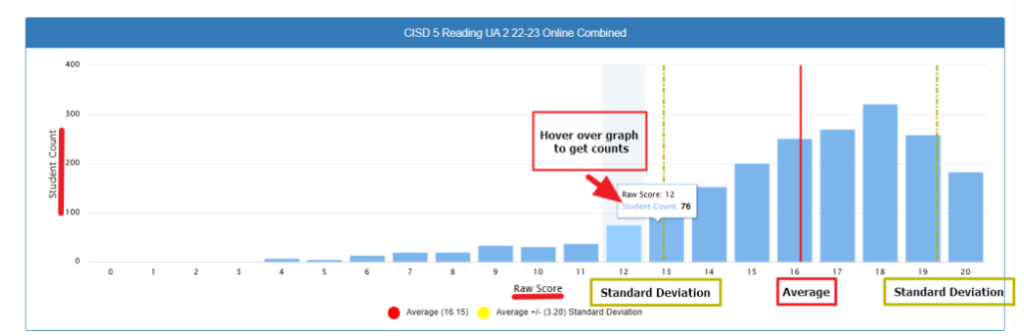
What This Chart Shows
This graph displays the distribution of student raw scores on the CISD 5th Grade Reading UA 2 (2022–2023 Online Combined) assessment.
- The x-axis shows the raw scores students earned.
- The y-axis shows the number of students who received each raw score.
- Each blue bar represents the number of students who earned a specific score.
→ For example, when you hover over a bar, it shows details like:
• Raw Score: 12
• Student Count: 76
(meaning 76 students scored a 12). - The red vertical line marks the average raw score, which is 16.15.
- The two dashed yellow lines represent one standard deviation above and below the average score.
• The standard deviation is 3.20 in this case.
• This means most students scored between about 13 (16 – 3) and 19 (16 + 3). - At the bottom, there are clear labels highlighting the Average and Standard Deviation points for easy reference.
The Big Picture
Great News! Your students did really well on this reading assessment! Most students scored between 13-20 points, which shows strong reading skills across your class. The chart shows a “mountain” shape that’s tilted toward the higher scores – this is exactly what you want to see.
What the Key Numbers Mean
Average Score
16.15 Think of this as the “typical” score in your class. Out of 20 possible points, your average student scored about 16 points – that’s 80%! This suggests most students have solid reading comprehension skills.
The Yellow Lines
These help you identify which students might need extra support or enrichment. Students scoring below the left yellow line (around score 13) may benefit from additional reading interventions. Students scoring above the right yellow line (around score 19) might be ready for more challenging material.
What This Means for Your Teaching
Students Needing Support
Look for students who scored below 13. These students may need:
- Small group reading instruction
- Additional phonics or comprehension strategies
- More one-on-one reading time
Most of Your Class
The majority of your students (those scoring 13-19) are reading at grade level and making good progress. Continue with your current instruction while providing differentiated activities.
High Achievers
Students scoring 19-20 are excelling and may need:
- More complex texts
- Leadership roles in reading groups
- Independent reading projects
Practical Next Steps
- Celebrate this success with your students – they’ve worked hard!
- Use this data to form flexible reading groups
- Plan targeted interventions for students scoring below 13
- Consider enrichment activities for top performers
- Continue monitoring progress with future assessments
Remember, this is just one snapshot in time. Students grow at different rates, and this data helps you know where to focus your instruction to help every student succeed.